
Role: Graphic Designer
Tools: Photoshop, Illustrator
Focus: Brand Update • Brand Guidelines • Visual Identity • Typographic & Color System
Tools: Photoshop, Illustrator
Focus: Brand Update • Brand Guidelines • Visual Identity • Typographic & Color System
T-Formation, a t-shirt manufacturer specializing in screen printing and direct-to-garment printing, desired a total rebrand to more accurately communicate their mission of delivering perfection to all their customers. This rebranding project involved major updates to the logo, color palette, typography, and overall web presence.

The overall goal was to bring the brand into a modern context while communicating a sense of perfection. This required incorporating contemporary design elements without losing the essence of the original brand.
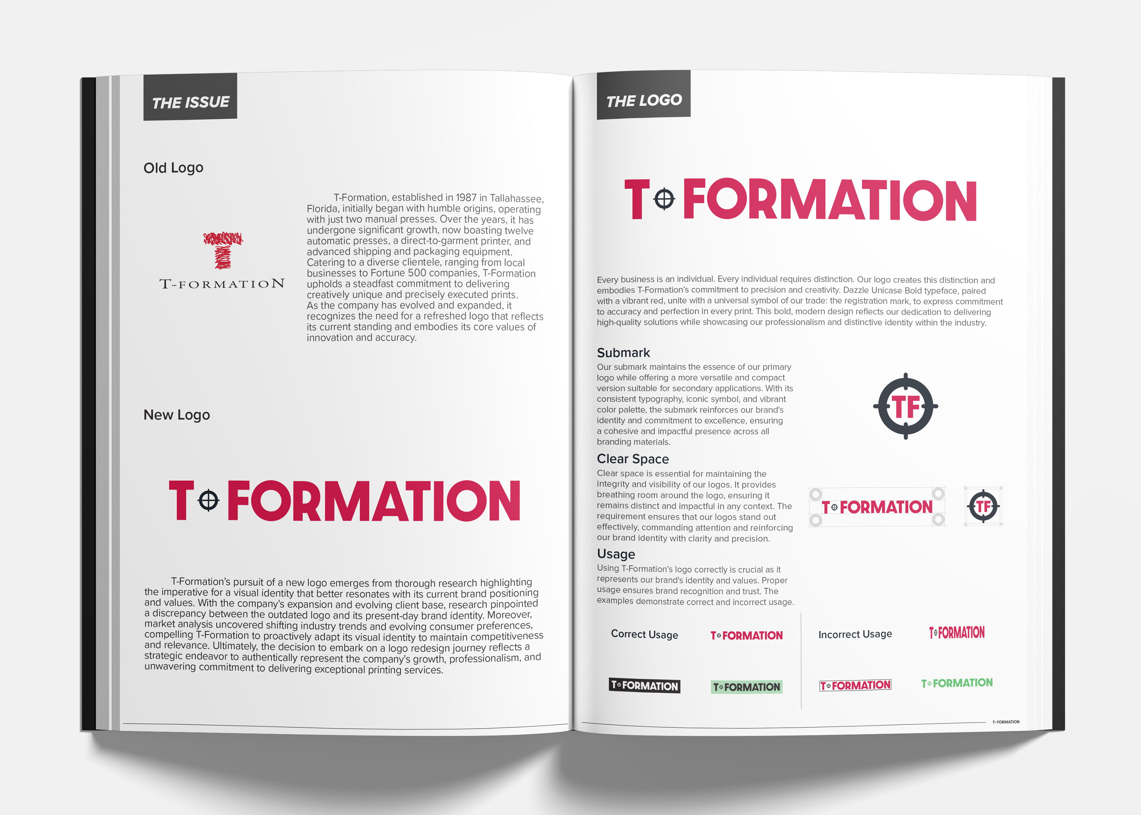
In order to align with T-Formation's commitment to high-quality production, the new logo was designed to represent modernity and precision. The challenge was to create a design that would resonate with both large corporations and individual clients, ensuring broad appeal and professional aesthetics.
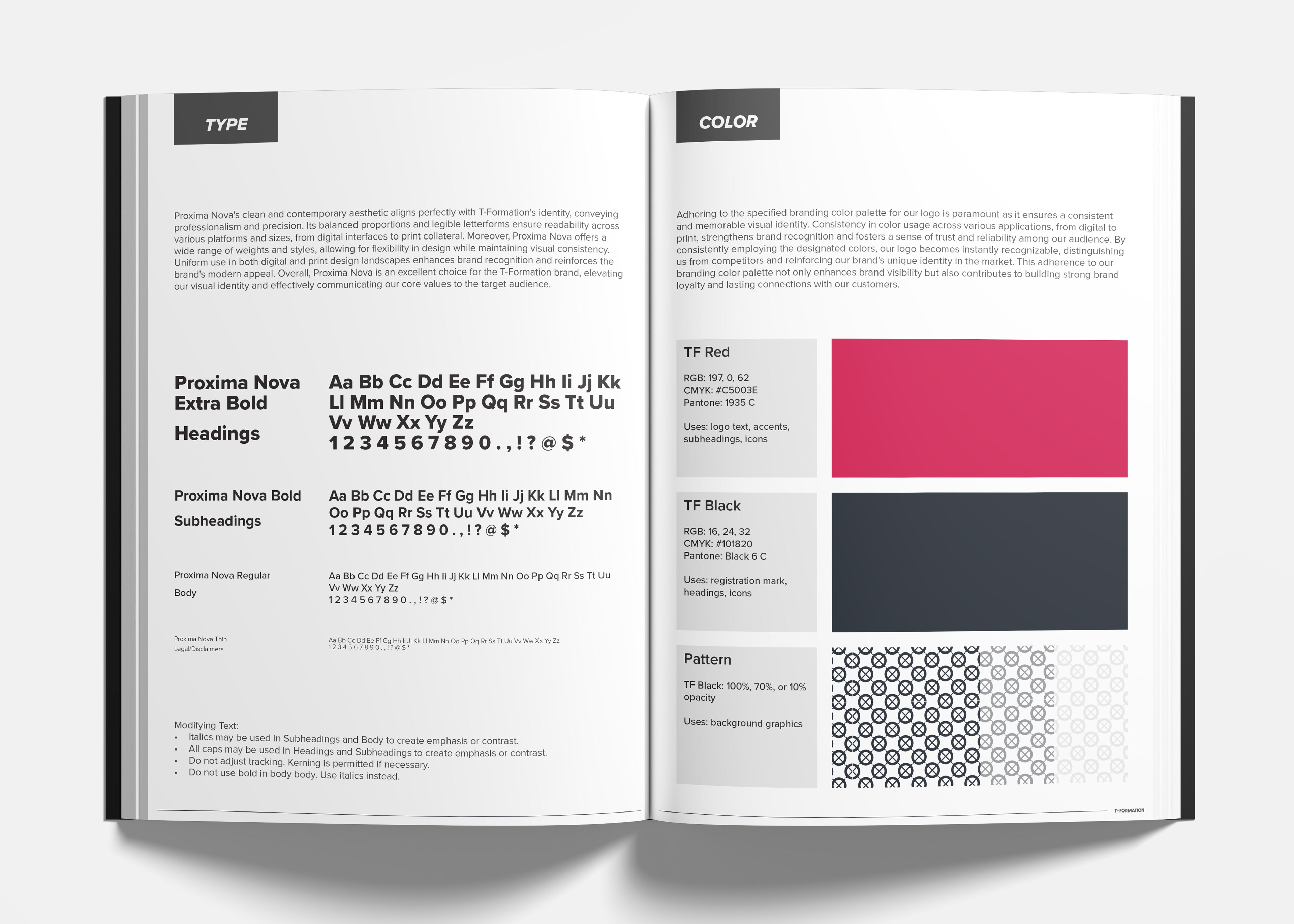
The typography was updated to a clean, modern font that ensures readability and style. This choice reflects the brand's evolution while maintaining an approachable tone suitable for a diverse customer base.
A curated color palette was chosen to evoke trust and creativity. A cool-toned black symbolizes reliability and professionalism, while vibrant red injects a sense of energy and innovation, capturing the character of T-Formation’s dynamic approach.
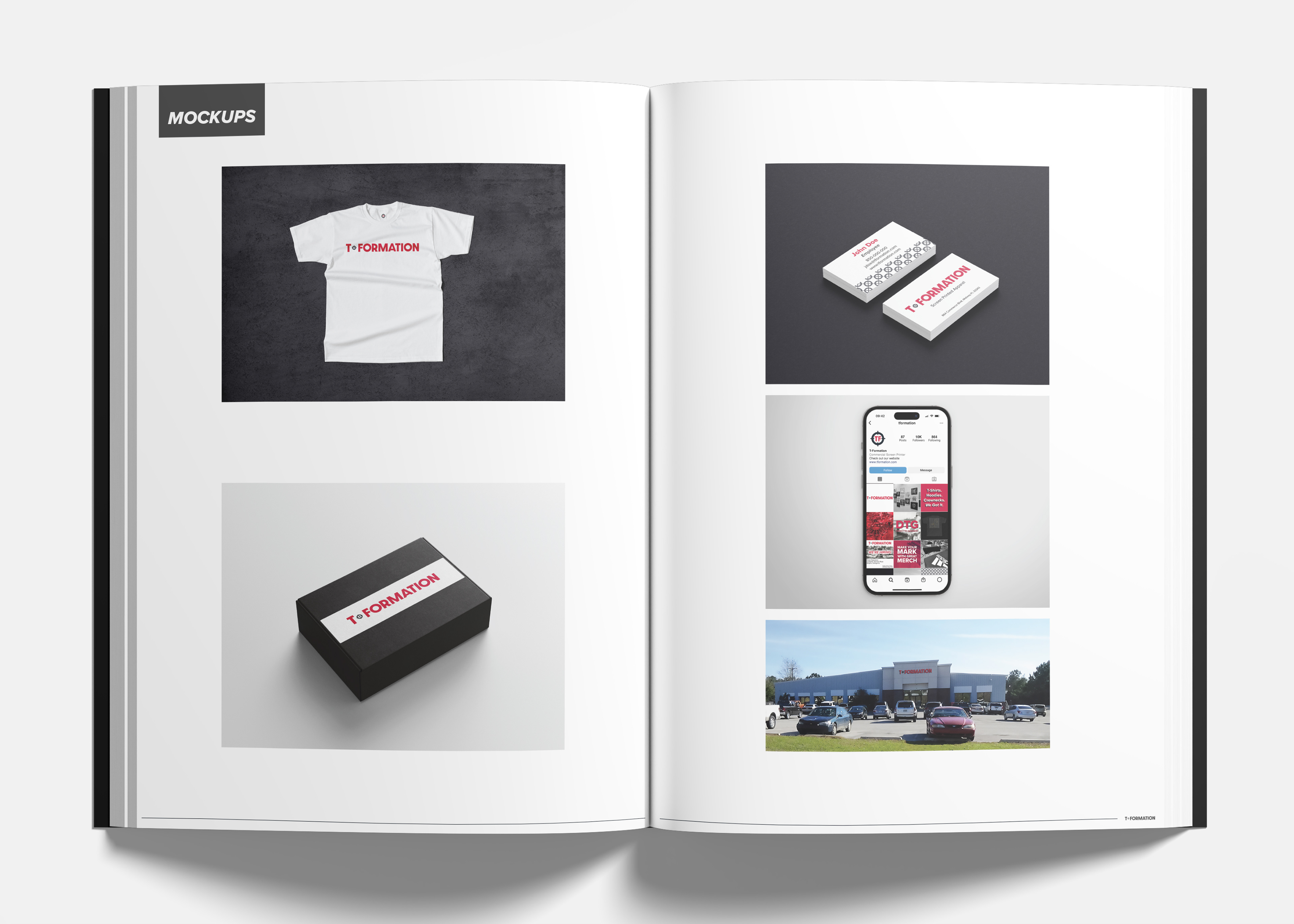
These mockups include examples of the new logo on various shirt designs, social media posts, business cards, and promotional materials. This visual representation is essential for ensuring that the rebranded identity is maintained and effectively understood.