Role: Art Director & Graphic Designer | Tools: Illustrator & Photoshop | Focus: Branding & Brand Guidelines
The Problem
Spearhead Strategies was a new digital marketing affiliate network with a sales-driven model. They needed a logo that represented their strengths, values, and mission.
The Goal
Design a logo for Spearhead Strategies that is approachable, aspirational, and memorable. The brand should stand out with a mark that feels fresh, forward-looking, and easy to connect with.
The Process
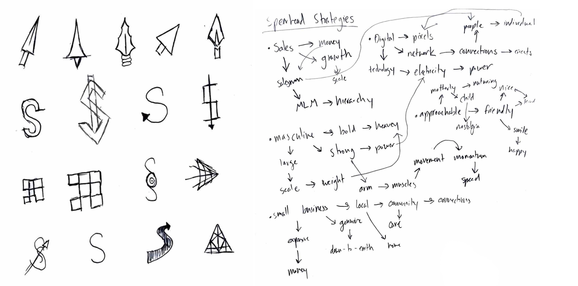
After meeting with the client to discuss their services, target audience, and vision, I began brainstorming, ideating, and researching. This early stage helps me explore different directions and narrow them down to the strongest solutions for the client.
The Concepts
I presented Spearhead Strategies with four unique concepts, each developed from the research, brainstorming, and exploration completed during the early stages of the project. Each direction approached the brand from a different perspective while staying rooted in the client’s goals, audience, and overall vision.




The Result
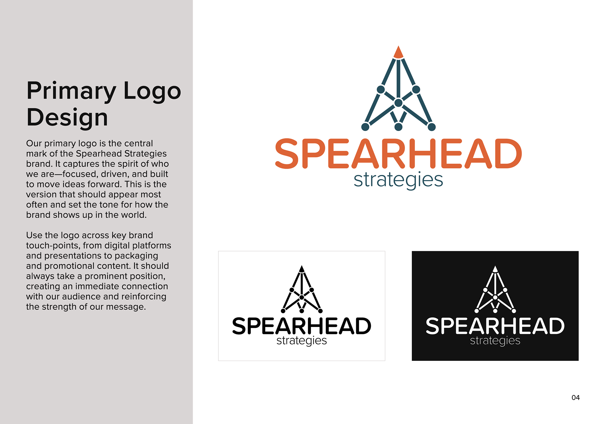
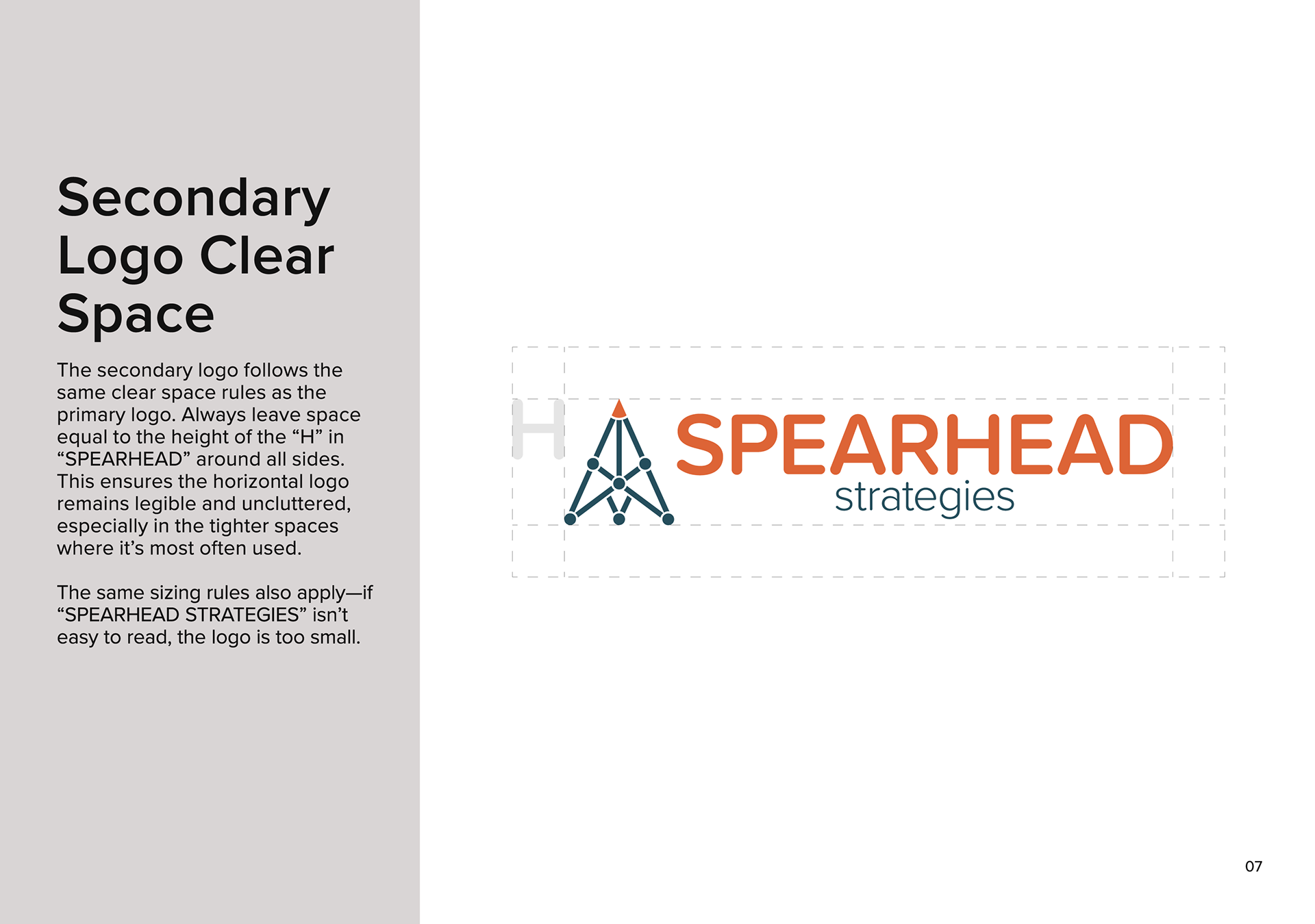
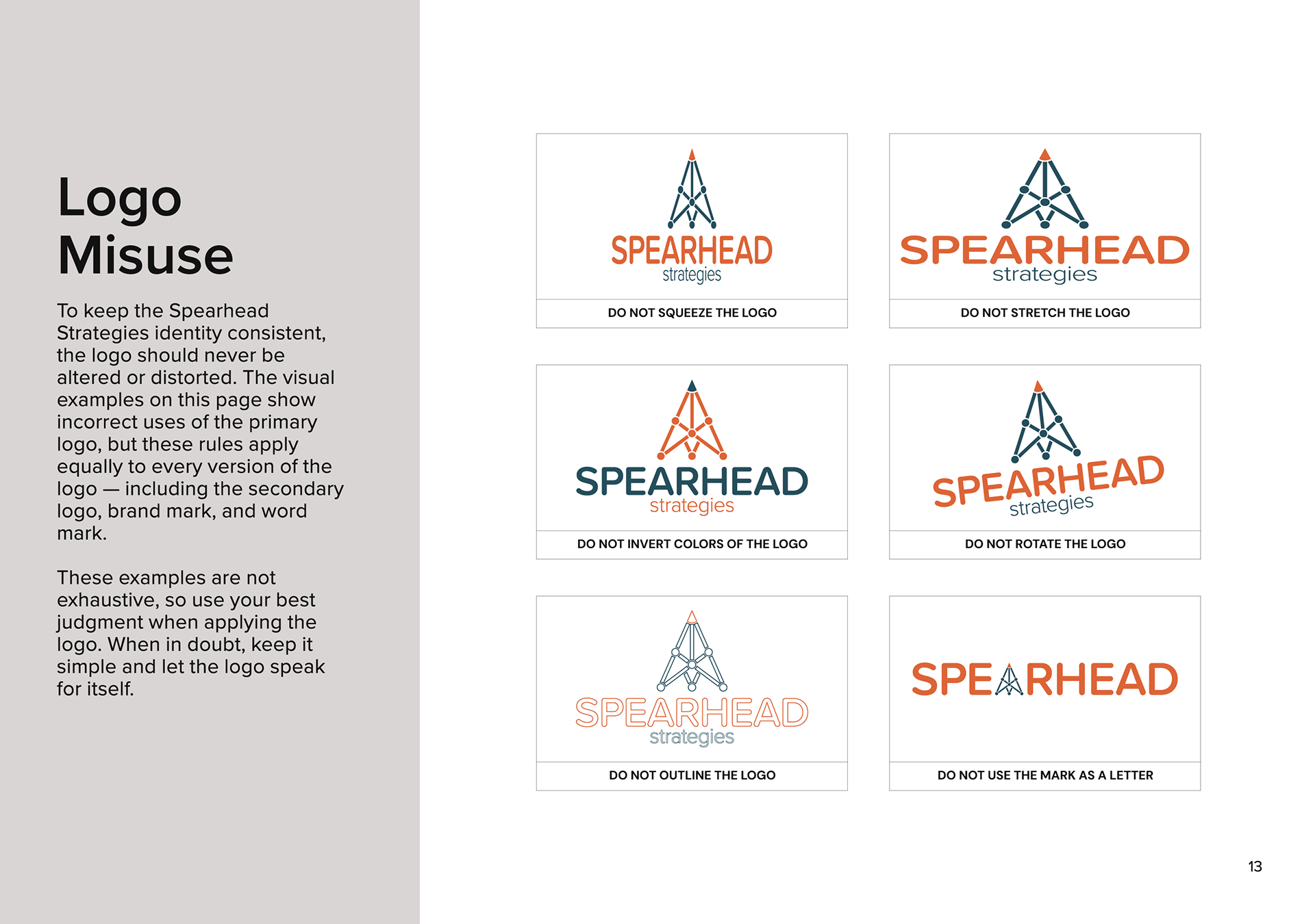
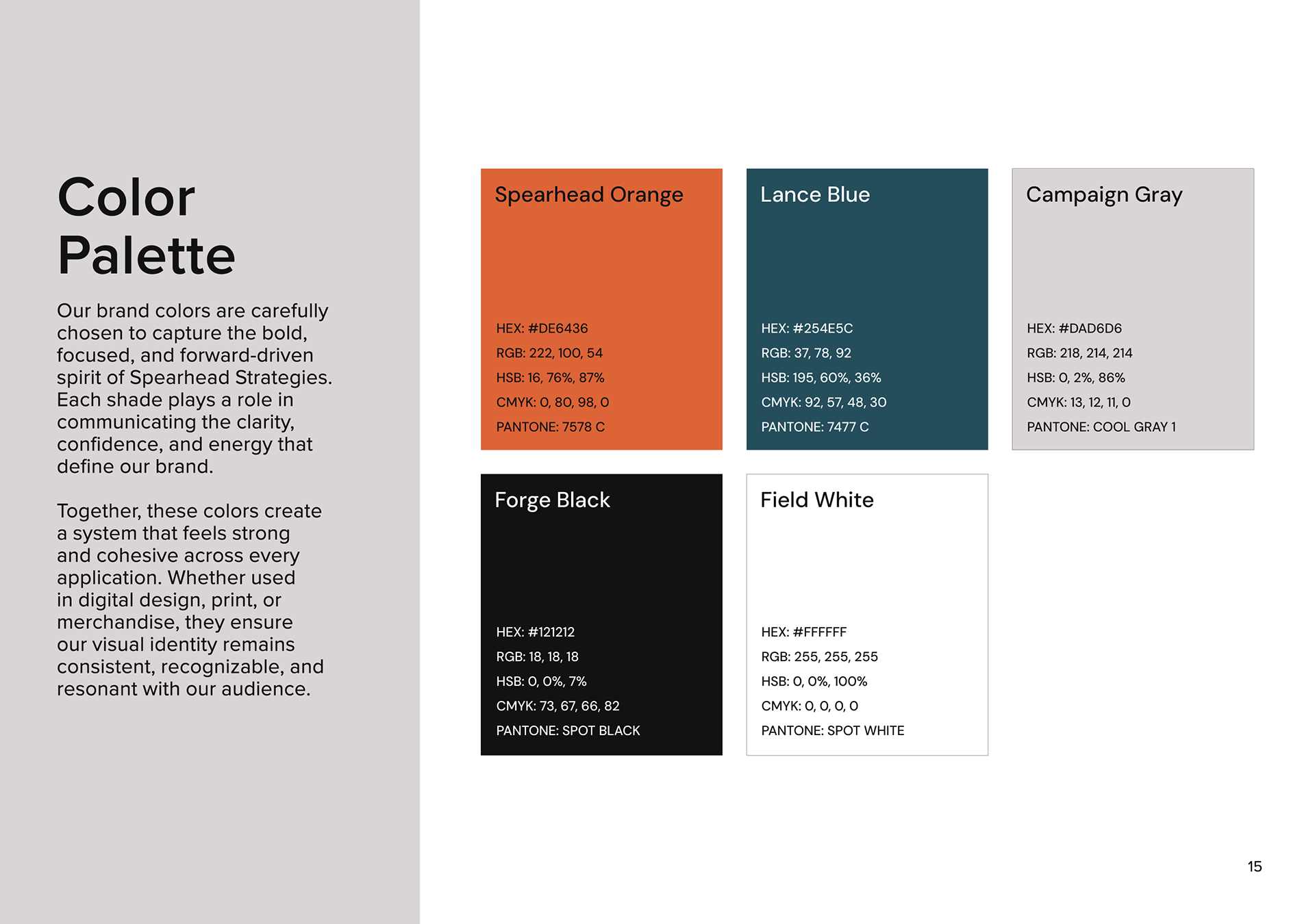
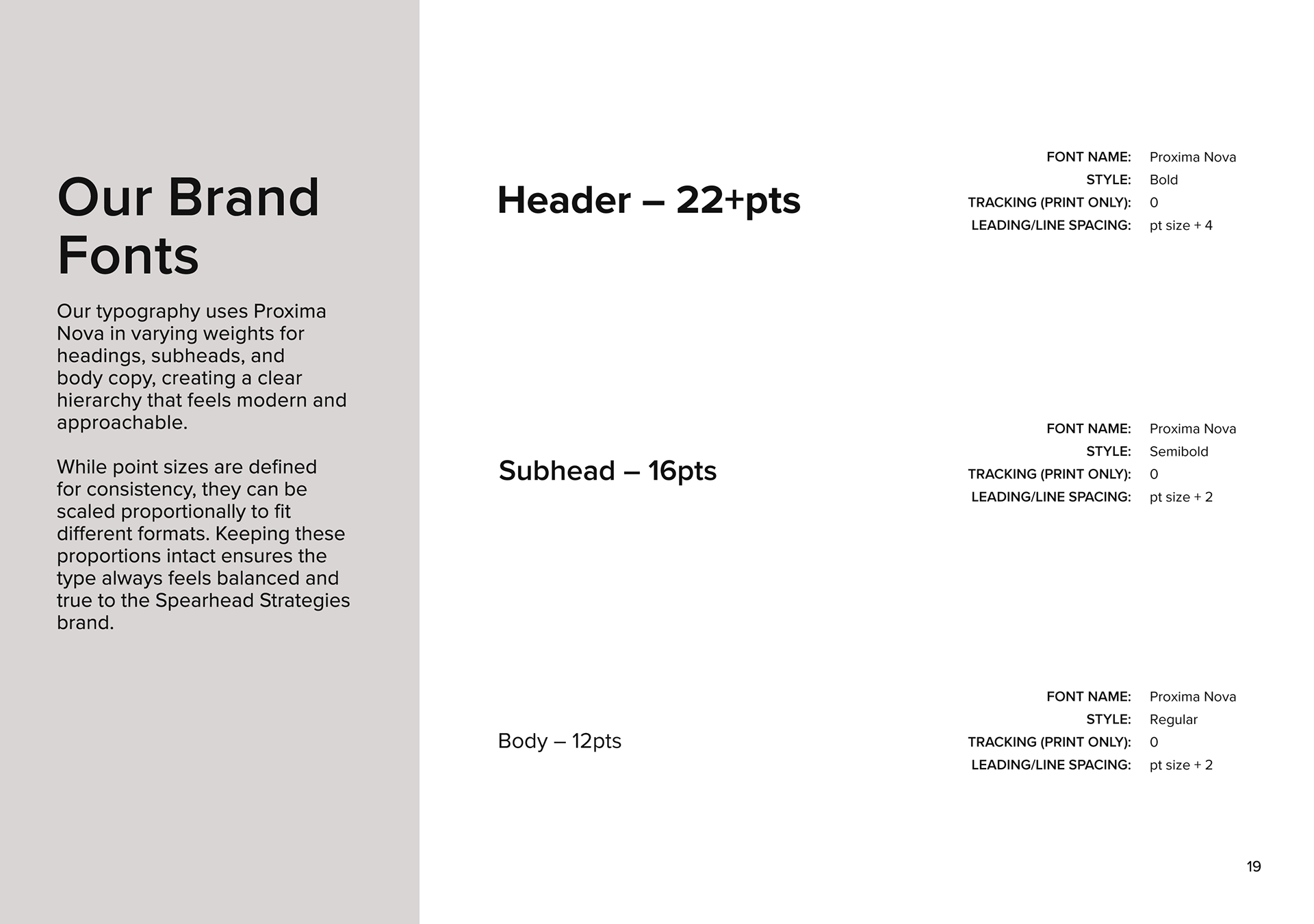
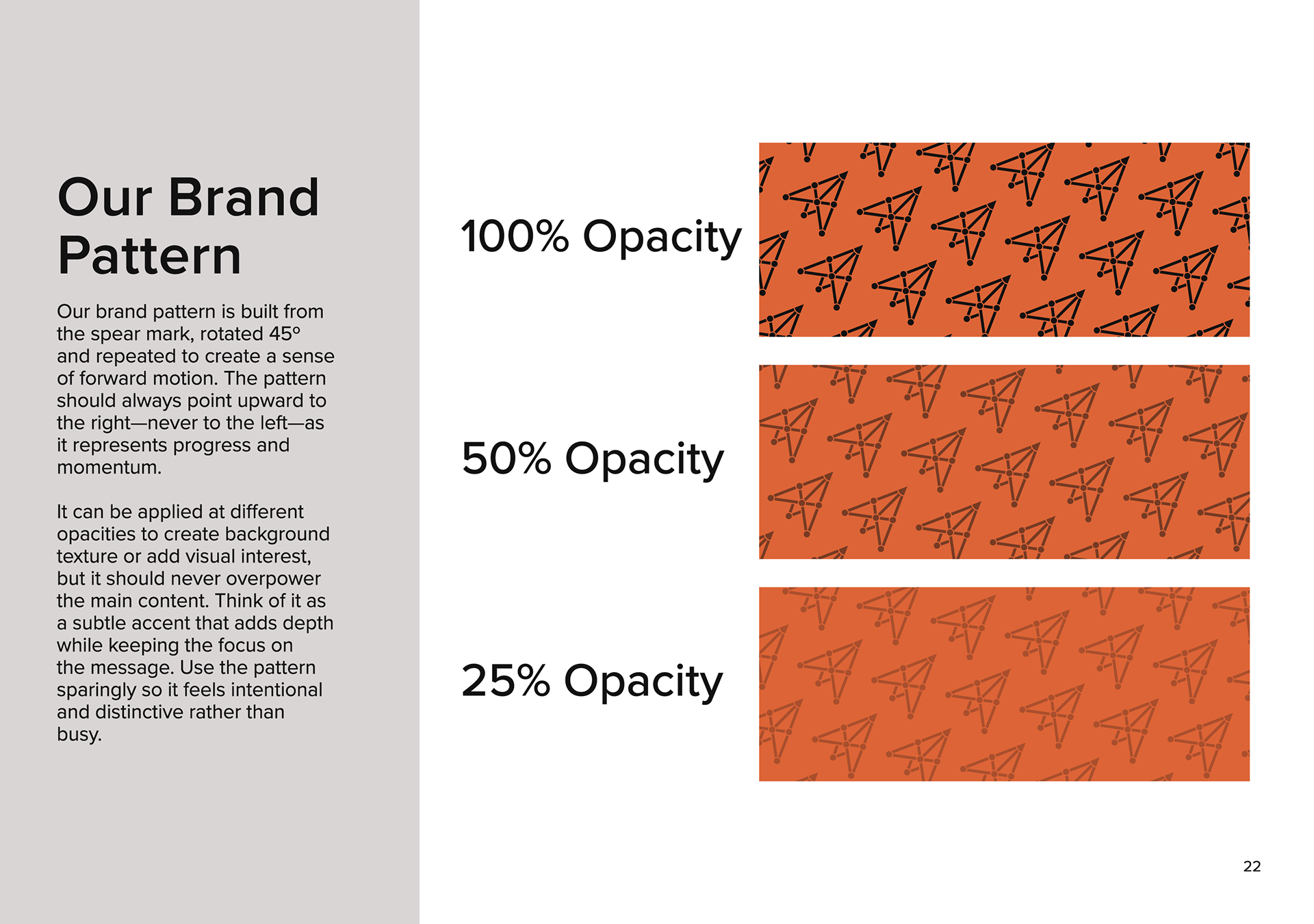
After refining the selected logo from round one, I developed and delivered a complete logo suite with multiple variations for use across different applications. I also created visual brand guidelines covering logo spacing, proper and improper usage, typography, and color to help maintain consistency across the brand. To further expand the identity, I developed a custom brand pattern using the negative space found within the logo, creating an additional visual element that still felt directly connected to the core mark.